More self promo
SO, here's a couple "mock-ups" I need a postcard flyer for an upcoming horse fair.
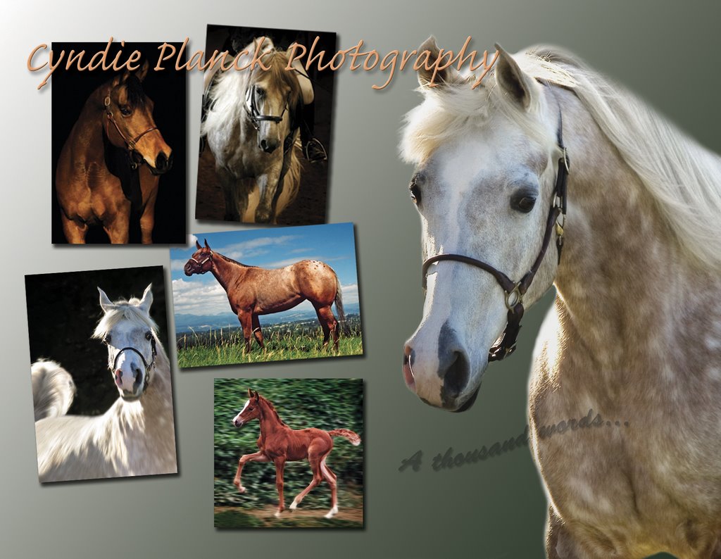
Which card front do you like best? I thought I would put this up here and get some feedback...


Which card front do you like best? I thought I would put this up here and get some feedback...

posted by Wingnut at 6:14 PM
![]()
![]()

4 Comments:
Hey! I'm glad you dropped by my site, I haven't seen you around there for a while.
I like the second one with just the one horse on it the best. The first one does show more of your work though. Maybe have a strip of those images running down the right side of the second image? Just an idea.
I like them both a lot, but that second photo is so dramatic.
If I had to pick one, I'd go with the first one. It visually shows more about what you can do for the prospective customer.
I think Chad's idea is good too, since that second card's photo is so nice. But the white "main" horse in the first card has lots of attitude that you captured, and if I owned a horse, I would want his personality to come out like that.
I'm not much help, but it's all beautiful work.
I like the second one, just the one horse, I love the colors, and, it is really a artistic shot. I hope that helps!
Not that my opinion matters but I really like the one horse shot. Of course I love this pic in real life!!
Post a Comment
<< Home