YOUR VOTES PLEASE!
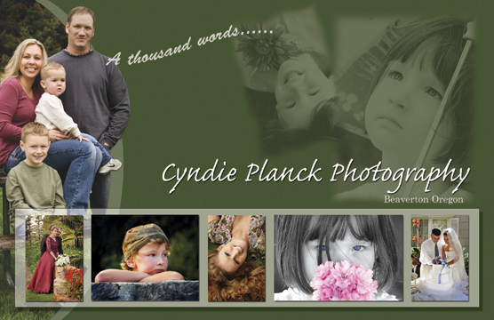
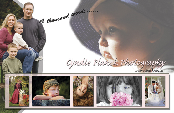
OK, I need some help.... I am in need of some promotional materials to hand out and send in the mail... Vista print offers oversized post cards fairly reasonable, (you can also find a coupon code for 50% online any order over 50 bucks...) so I downloaded their psd and I made these up today and wanted to share, Any suggestions? Which one of these is YOUR favorite? Votes please?!
Basically I am having a hard time picking one to use... I have a favorite, but I want to see what you all think first? The backside will be printed with my contact info, and price list for sittings etc....
posted by Wingnut at 10:46 PM
![]()
![]()

7 Comments:
I like the first one. I think it has more "pop."
BTW, Planck is not the most common name in the world. I knew a Planck family growing up in Connecticut. Any relations back that way?
Anyway, for what it's worth, I really like the first card.
I orefer the first one too, perhaps because it has a more dark background. But, the image on the second, the child with hat, is beautiful, perhaps you can combine a darker color of the background with that image of the child with hat :)
I hope my english is understandable enough :)
(oh, for my photo, It is from a tank, I did not dive this time :)
I like the first one, with the green background, just has a warmer feel to me! Great idea, and I love the look!!!! Does the bakery get any????
Carie
Thanks everyone! It's funny, everyone likes the top one so far, except for me and a graphic designer friend, we prefer the bottom one, probably for many reasons, mainly for me, knowing that color in the final print will be much easier to match in white than the green backgorund, could come out a way different green etc from the printer. I think I like the baby photo better too, but am working up a newer edition so I will post that one when ready :)
Funny a tiny bit of training (and I do mean really tiny bit) makes me follow some "rules" (white) but when I put my own spin on the "rules" everyone I ask prefers the "out of the box" green version.... woo hoo for me I guess :)
And yep Carie, the bakery can have as many copies as you can hand out!
The White one (second). It's a little more simple with less going on. As a professional Graphic Designer, that's my choice. And that was before I read your comment;)
I looked at it some more and I think the text does "pop" more on the green, but I like the more simple image of the baby than the two images in that corner on the green. Maybe keep the green, but use the baby with it? Just an idea.
What a good job !
It can be used to do christmas card for instance
I would like to manage to do so pretty "montages", I presume, that is not too difficult... when somebody is able to show you how to do !!!
Post a Comment
<< Home